The Collective Kefir Range - Packaging Redesign
Claire Vickers
Freelance Senior Designer
BOL - Power Shakes packaging design refresh

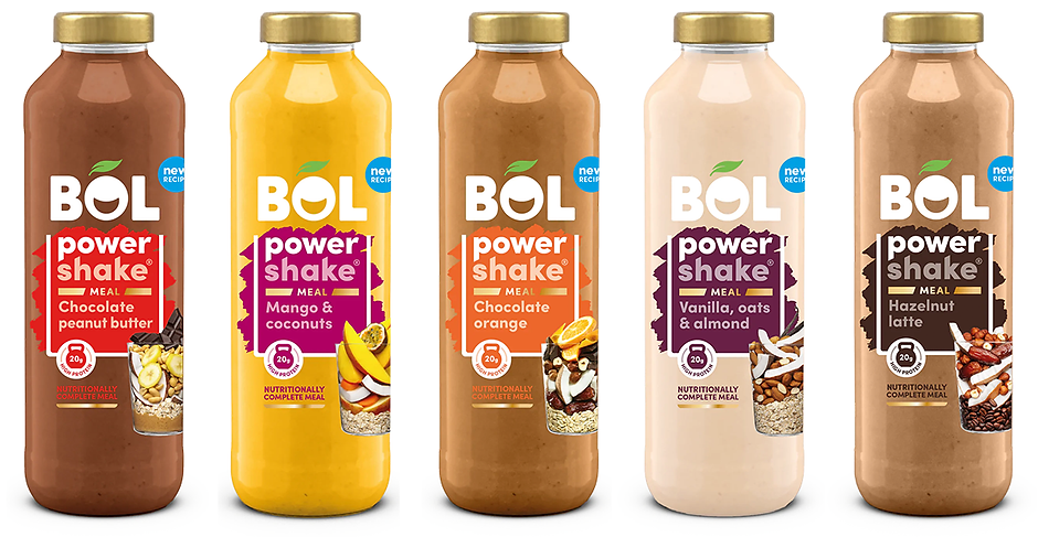
BOL's new look Power Shake range, including product reformulation across all the recipes and a new glass bottle. My brief was to de-clutter the design in comparison to the current label, make the range look less functional and more aspirational, with stronger taste cues and more prominence given to the flavour. Nutrtionally complete meal and the amount of protein were the two key supporting messages to feature on the front of pack.

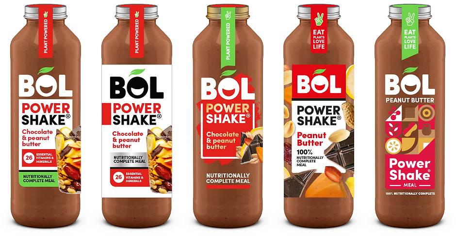
Here are a few of the early round options I explored for this design. Starting on the left with an evolution of the previous pack design taking on the demands and wishes of the brief, to more revolutionary changes as you move along the options from left to right.

A comparison of the old and new designs, complete with new photography to show off the ingredients packed into every bottle.